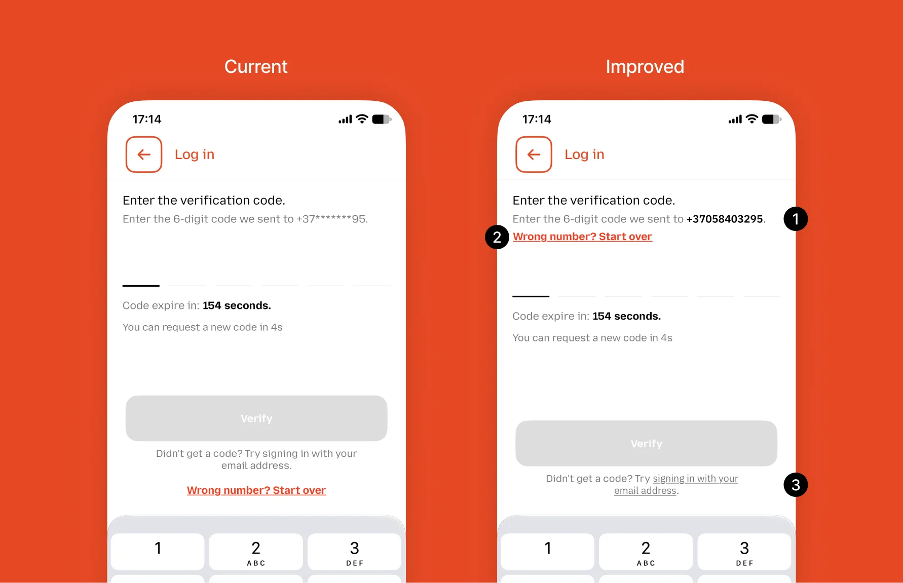
I opened Jeton app recently and noticed a few things on the login screen.
- Users can’t see the phone number they entered. The number was typed on the previous screen anyway, so hiding it makes little sense. Now they can’t check if it’s correct.
- The link to change the number is far from the number. Users look at the number at the top, but the fix is somewhere else.
- The email login is just plain text. It’s not clear how users can open it.
A quick fix, 80% of the result with 20% of the effort:
- Show the number and highlight it
- Put “Change number” next to it
- Make the email option a real link
There is more to improve, of course.
11 Nov
A sign that a business’s customer service needs work
My wife joined a fitness club. She filled in the registration form they gave her, got her card and started going.
A month later her access stopped working. At the reception they said she hadn’t signed the contract. But nobody gave her one.
“You didn’t sign the contract” and “We forgot to give you the contract” show two very different attitudes. The first one blames the customer. The second one takes responsibility.
When a business blames the customer, the problem is usually in its approach.
What do AI coding and fast food have in common?
Both are cheap calories. And it’s very easy to overeat / overbuild.
A follow-up to my recent post about the “one more iteration” habit.
Product teams ship faster now. Iterations are shorter. But are we shipping what users actually need?
Reflecting on a recent chat with Jonas Van Poucke about “feature indigestion”. Testing an idea on real users with something working sounds great. Still, understanding users first can be cheaper than testing everything live. Otherwise the product fills up with junk. If a feature works, nobody rebuilds it properly. If it doesn’t, nobody cleans it up.
Before, limits protected us from all of this. Now we have to set them ourselves.
3 Nov
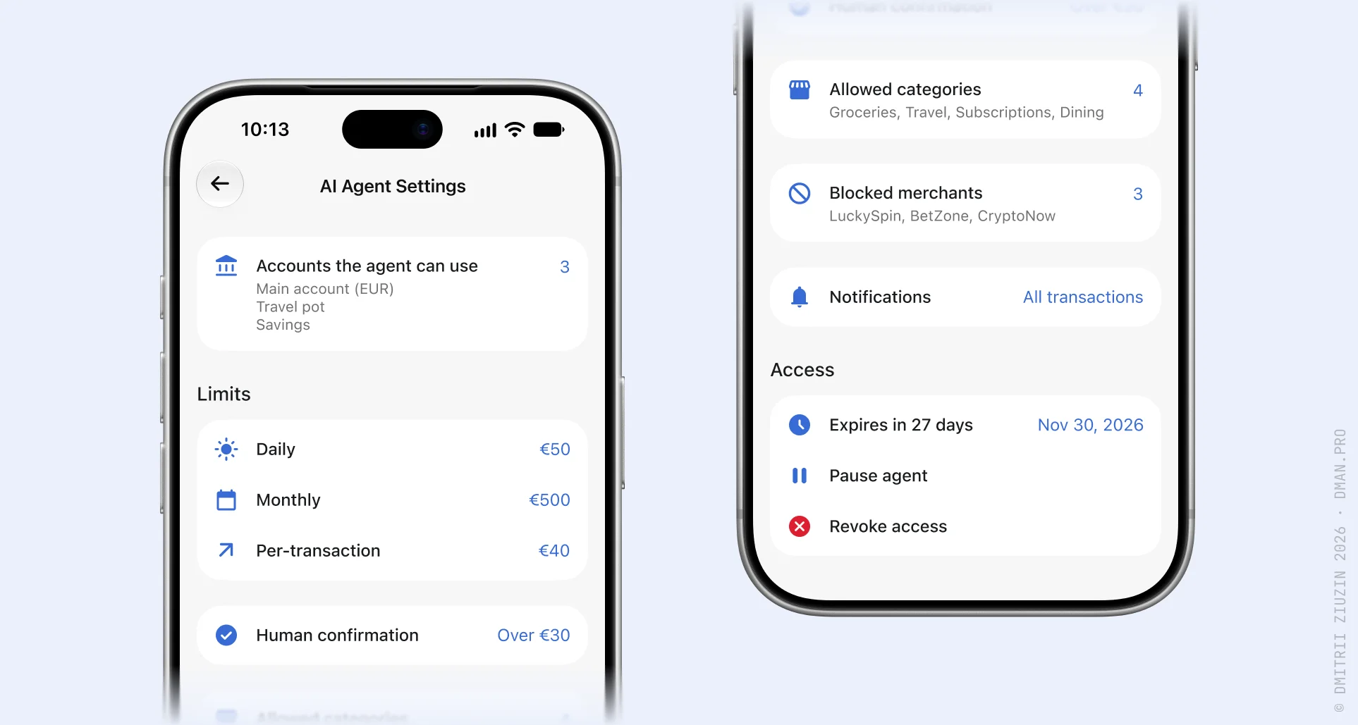
AI agent settings
AI is entering finance apps deeply.
Soon we will probably see AI agent settings in apps like Revolut.
We will set limits and access for financial agents the same way we already do for cards.
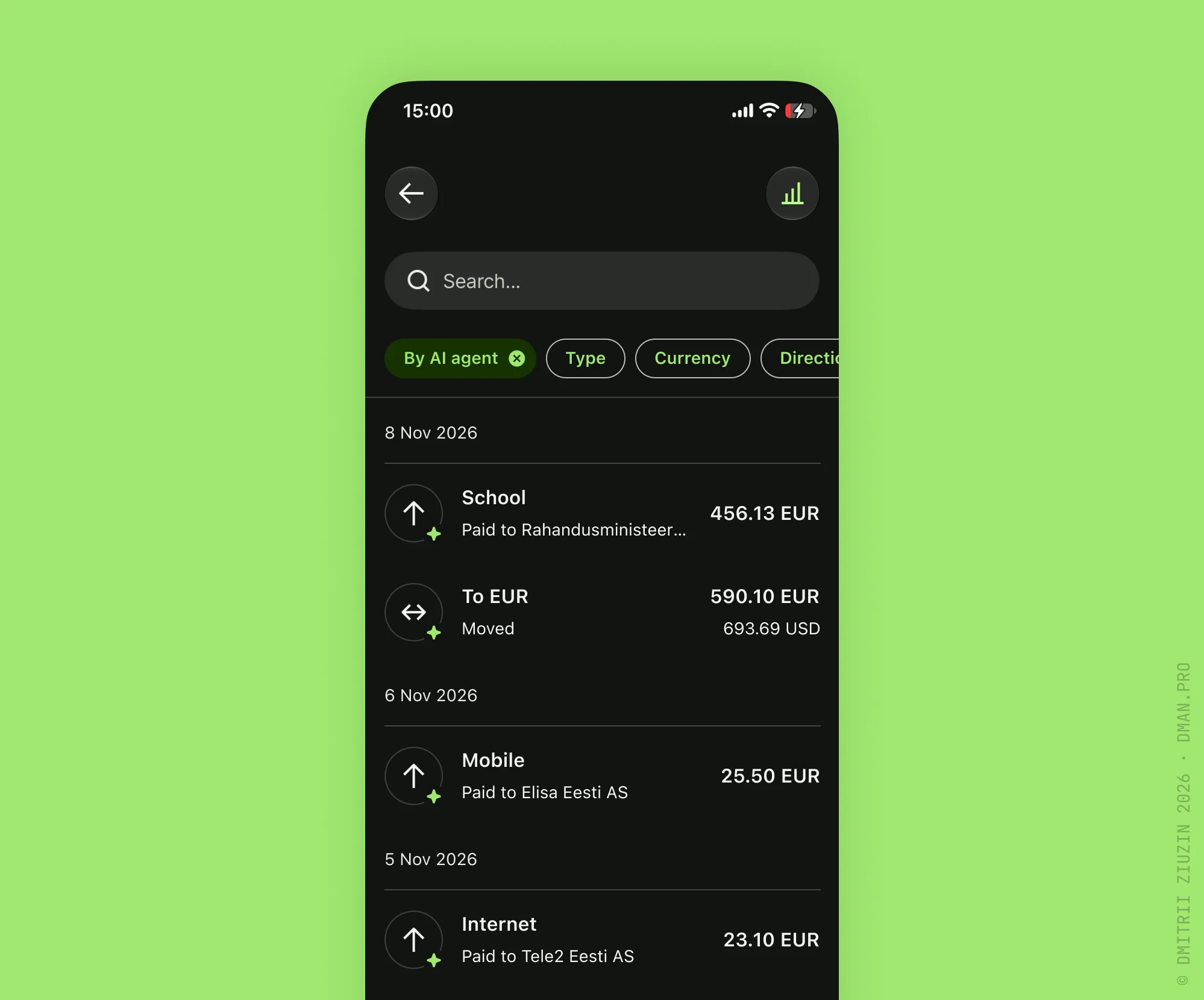
People should always see and control what agents do with their money.
What limit would you set first?
(Unofficial concept, not affiliated with Revolut. Sample data.)
29 Oct
AI summary payment
Every month I pay the same 5 bills.
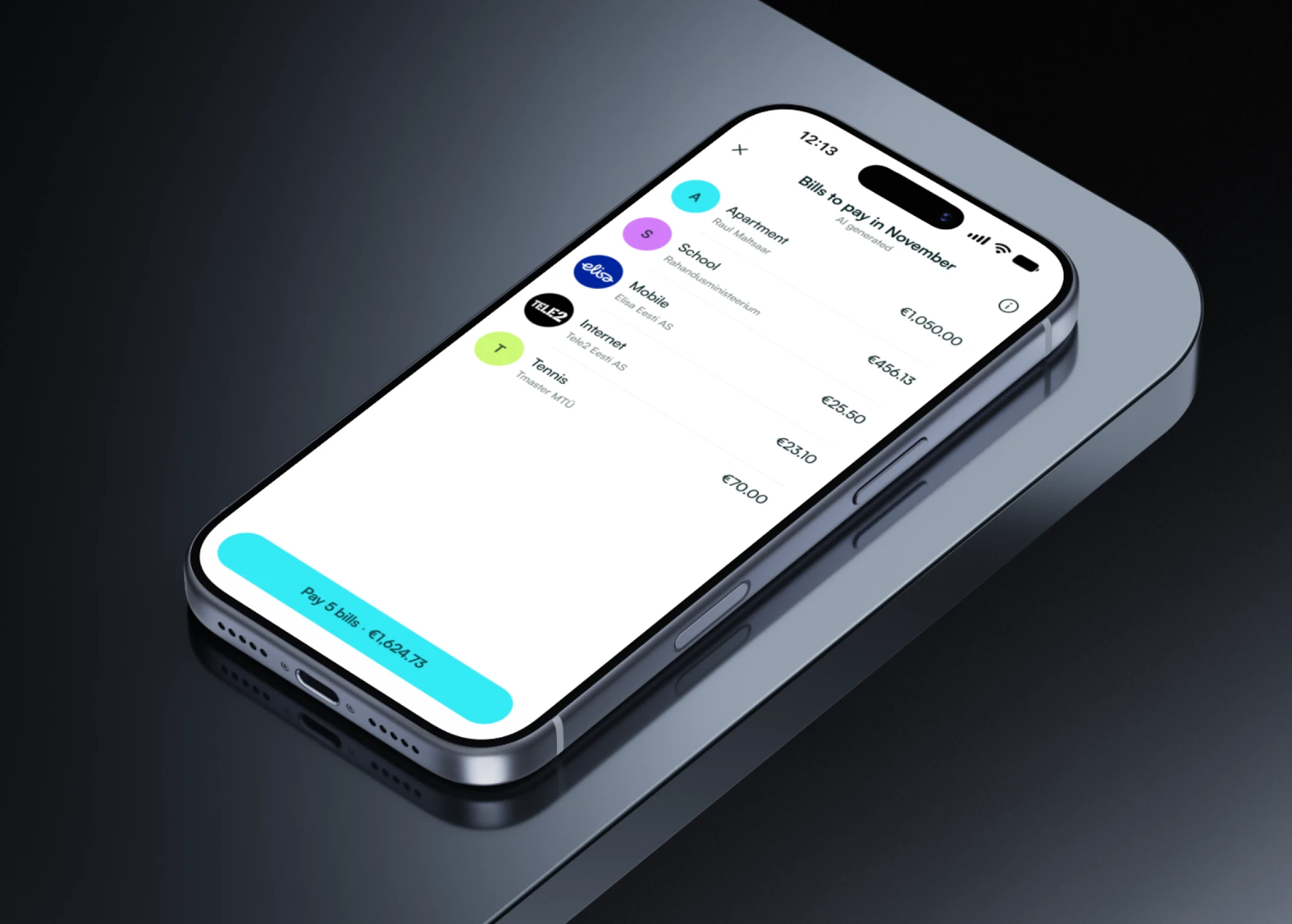
Rent. School. Mobile. Internet. My daughter’s tennis.
Same dates. Almost the same amounts. And every month I still do it by hand. Open the email. Find the invoice. Copy the details. Check the amount. Pay. Repeat.
Here is what I’d like AI to do instead. Read my inbox, find these invoices and collect them into one monthly bills basket. Show me the list and the total. And I approve it with one button.
The important part, it never pays without me. AI does the boring work. I keep the control.
For me this is where AI really helps normal people. Not one more chatbot, but less routine.
(Concept, sample data.)
27 Oct
One more iteration
We’re all a bit addicted to AI, aren’t we? Not to using it, to redoing things with it.
I see it in my own work. With Claude Code I can rebuild a screen or a whole flow in an hour. So I do it. Then again. And again. It feels like progress, but it’s a kind of drug.
Every “one more round” pushes back the moment when real users see it. The feedback loop gets longer, not shorter.
AI made building cheap. But until users see it, it’s still just a guess.
How do you stop yourself from “just one more iteration”?

Adding biometric confirmation to risky payments is first about fitting a new step into the current business process, and only then about the face or voice scan.
- Understand which modules are involved, how they interact, and which one makes the decision and when.
- Map every branch before drawing screens: no camera access, no consent, three failed tries.
- Keep a fallback, for example a call to support.
- Let people finish later without losing progress.
That’s how I approached biometric ID a while ago. Confirmation went from minutes to seconds for 8.5M monthly users.
20 Oct
DIM size guide that costs sales
How many sales does fashion e-com lose when customers can’t figure out their size?
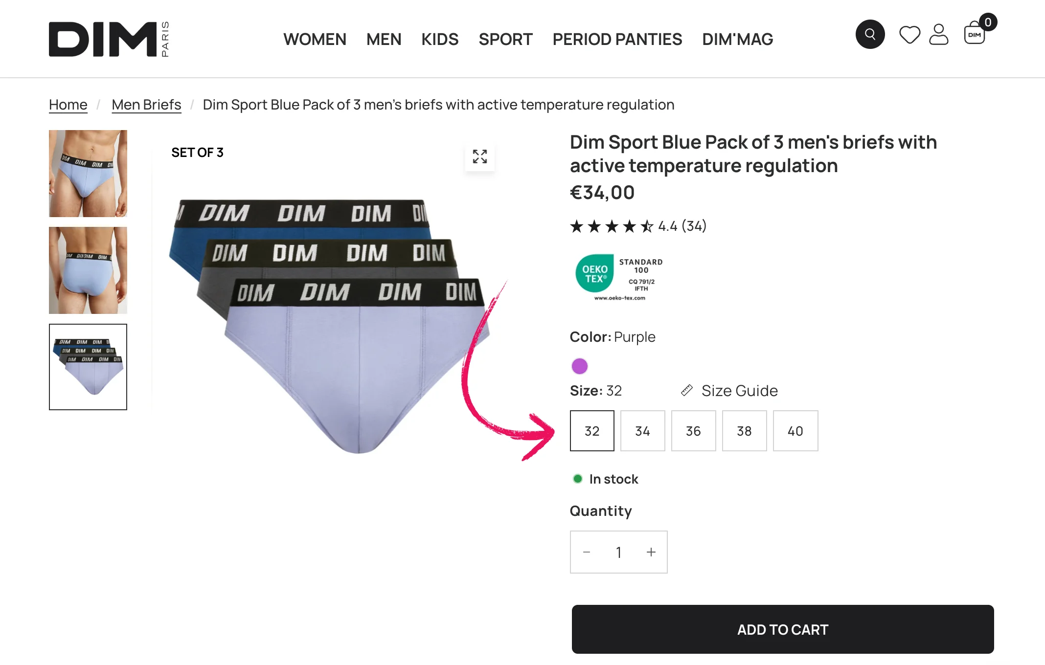
Recently I wanted to buy a pack of briefs on the DIM web store.
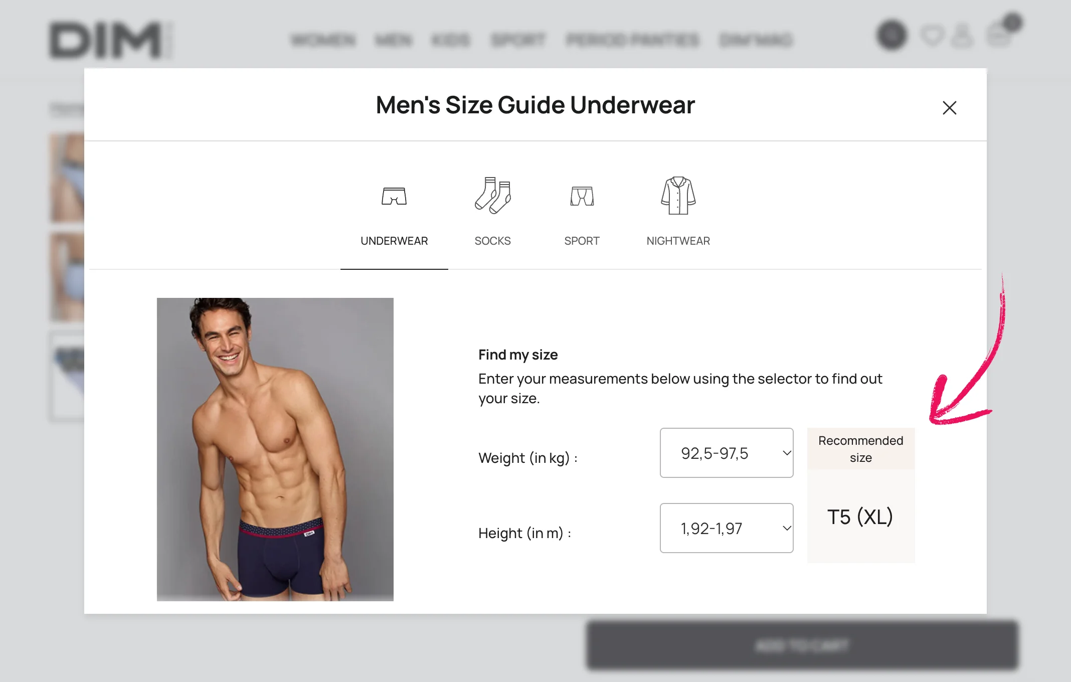
The product page offers sizes 32, 34, 36, 38, 40, and I have no idea which one is mine. The size guide takes my height and weight and says T5 (XL). Nothing like that on the product page.
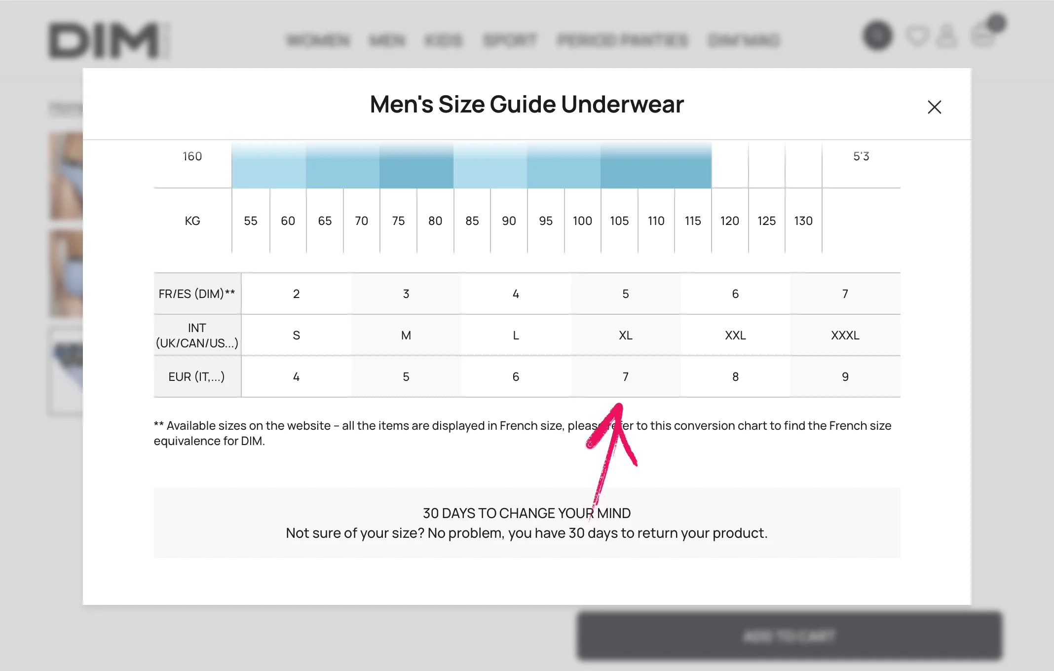
The guide even says all items are shown in French sizes, but 32–40 isn’t in the guide at all. My order history doesn’t show sizes either. The items themselves don’t have 36 or 38 on them. Even AI couldn’t tell which size is mine.
And the store’s answer: just return it within 30 days.
Zero clarity.
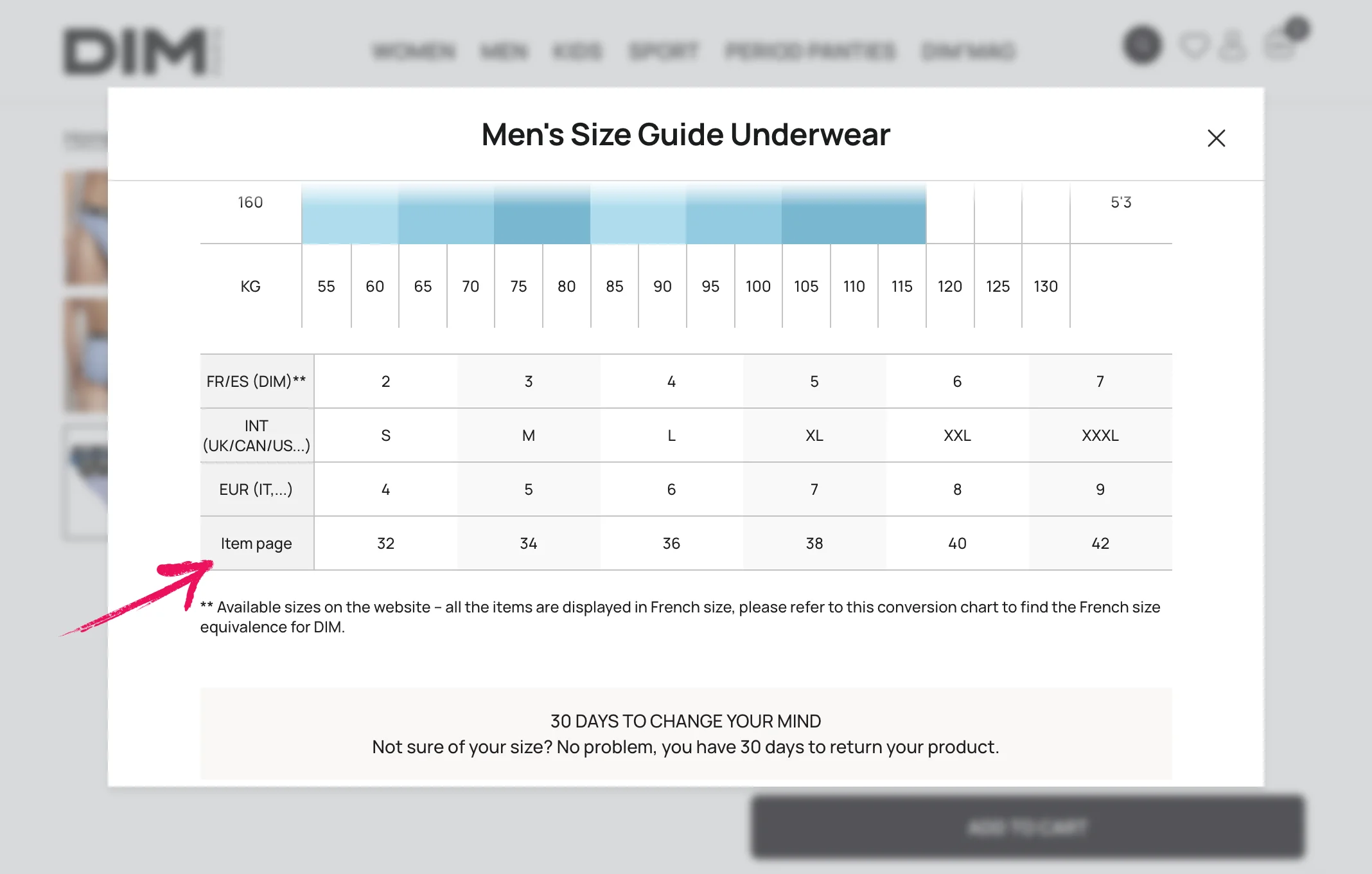
The real fix is not hard: just add one extra row to the size table.
I’m curious what share of customers give up here, and how much money it costs the brand.